Wedding Color Ideas: Your Complete Guide to Stunning Palette Combinations
Choosing your wedding color palette marks one of the most exciting steps in planning your big day. The right color combination sets the tone for your entire celebration and creates a cohesive look across every detail.
Your wedding colors influence everything from invitations to florals. They create the atmosphere guests experience from the moment they receive your save-the-date.
This guide explores over one hundred stunning color ideas spanning every season and style. You’ll discover practical tips for selecting combinations that reflect your personality while complementing your venue and wedding date.
Start Your Color Planning Journey
Explore professional wedding color planning tools and resources to organize your perfect palette.
Understanding Wedding Color Palettes and Their Impact
A wedding color palette typically consists of three to five coordinating hues that work together harmoniously. Your palette guides decisions about every visual element throughout your wedding day.
Understanding how colors interact helps you create depth and visual interest. Most successful palettes include a primary color, one or two secondary colors, and accent shades for highlighting special details.
The Psychology Behind Wedding Colors
Colors evoke specific emotions and create distinct atmospheres. Warm tones like coral and gold radiate energy and celebration while cool blues and greens promote calmness and elegance.
Your color choices communicate your wedding style before guests even arrive. Bold jewel tones suggest formal sophistication while soft pastels create romantic, whimsical vibes.
Warm Color Palettes
Warm hues bring energy, passion, and warmth to your celebration. These colors work beautifully for autumn and summer weddings.
Red and burgundy combinations
Orange and coral pairings
Golden yellow accents
Terracotta and rust tones
Cool Color Palettes
Cool shades create serene, sophisticated atmospheres. These colors shine in spring garden ceremonies and winter celebrations.
Navy and dusty blue combinations
Emerald and sage green pairings
Lavender and purple options
Silver and icy blue accents
Creating Balance With Color Ratios
The most visually appealing palettes follow the 60-30-10 rule from interior design. Your dominant color appears in roughly sixty percent of elements while your secondary color covers thirty percent and accent shades highlight the remaining ten percent.
This ratio creates harmony without monotony. It allows your primary color to establish the overall mood while supporting hues add dimension and your accent color provides exciting pops throughout the venue.
Spring Wedding Color Ideas That Celebrate Renewal
Spring weddings embrace the season’s natural beauty through fresh, vibrant color combinations. The season offers perfect conditions for incorporating light, cheerful hues that mirror blooming gardens.
Popular spring palettes draw inspiration from nature’s awakening. Think blush pinks reminiscent of cherry blossoms, soft greens echoing new growth, and pastel purples matching fields of lavender.
Classic Pink and Blue Spring Combinations
The pink blue color combination remains eternally popular for spring celebrations. This pairing balances romance with tranquility creating an elegant, timeless look.
Blush pink paired with dusty blue creates sophisticated elegance. Add ivory or cream as a neutral base and incorporate gold accents for warmth. This palette works beautifully for both garden and ballroom venues.
For a bolder approach, combine hot pink with navy blue. This high-contrast option adds modern energy while maintaining spring freshness. Balance these strong hues with white florals and light wood elements.
Garden-Inspired Green and Coral Palettes
Coral brings warmth to spring color schemes without overwhelming softer seasonal tones. When paired with various greens, coral creates a fresh, garden-party atmosphere.
Combine coral with sage green for an earthy, organic feel. Add cream and touches of gold to prevent the palette from feeling too casual. This combination photographs beautifully in outdoor spring settings.
Peach tones offer a softer alternative to bright coral. Mix peach with mint green and ivory for a delicate, romantic palette perfect for daytime spring ceremonies.
Lavender and Yellow Spring Brightness
Lavender and yellow create cheerful, unexpected combinations that capture spring’s playful spirit. This pairing works especially well for outdoor garden weddings and rustic celebrations.
Soft lavender with butter yellow delivers gentle warmth. Include white and light gray to balance these colors and prevent the palette from appearing too sweet. This combination suits both formal and casual spring events.
Deep purple paired with golden yellow creates more dramatic contrast. This bolder version works beautifully for evening spring receptions where richer colors complement artificial lighting.
Bring Your Spring Palette to Life
Find beautiful spring wedding decor, fresh flower alternatives, and color-coordinated details for your celebration.
Summer Wedding Color Ideas for Vibrant Celebrations
Summer weddings allow for bold, saturated colors that complement long sunny days and warm evenings. The season supports both vibrant tropical palettes and sophisticated jewel tones.
Heat and brightness influence summer color choices. Rich, deep hues prevent washed-out appearances in intense sunlight while bright accent colors create festive, energetic atmospheres.
Tropical-Inspired Bright Combinations
Tropical color palettes channel vacation vibes and destination wedding aesthetics. These combinations work perfectly for beach ceremonies, outdoor garden receptions, and poolside celebrations.
Fuchsia paired with turquoise creates instant tropical energy. Add coral and lime green as accent colors with white serving as your neutral base. This palette demands outdoor settings where natural light makes colors pop.
For slightly subdued tropical vibes, try coral with aqua blue. Include peach and soft yellow to warm the palette while maintaining beach-appropriate brightness.
Classic Navy and White Summer Elegance
Navy blue brings sophistication to summer celebrations without sacrificing seasonal appropriateness. This versatile color anchors countless successful summer wedding palettes.
Traditional navy and white creates timeless nautical elegance. Incorporate gold accents and blush pink florals to soften the crispness. This combination suits both waterfront venues and formal ballrooms.
Navy paired with ivory and burgundy offers rich sophistication. Add greenery and touches of copper for an elevated summer evening palette that transitions beautifully from ceremony to reception.
Sunset-Inspired Warm Summer Tones
Sunset colors capture summer’s golden hour magic. These warm palettes work exceptionally well for evening outdoor weddings where they complement natural lighting transitions.
Combine burnt orange with dusty rose and lavender for gradient sunset effects. Include gold and cream to create smooth color transitions. This palette photographs dramatically during actual sunset ceremonies.
Coral, peach, and soft yellow create lighter sunset interpretations. Add touches of blush pink and ivory for romantic warmth perfect for summer garden celebrations.
Jewel Tone Summer Richness
Jewel tones bring unexpected depth to summer weddings. These rich colors create luxurious atmospheres while maintaining vibrancy appropriate for the season.
Emerald green paired with sapphire blue creates regal summer elegance. Add amethyst purple accents and gold details for a palette that works beautifully in both garden and ballroom settings.
Ruby red combined with emerald green and gold offers classic richness. Balance these intense hues with ivory florals and neutral linens to prevent overwhelming visual impact.
Fall weddings embrace the season’s rich, warm color palette inspired by changing leaves and harvest abundance. These deeper tones create intimate, cozy atmospheres perfect for autumn celebrations.
Autumn offers nature’s most dramatic color transformations. Your wedding palette can mirror this seasonal shift through burnt oranges, deep burgundies, and golden yellows that capture fall’s essence.
Classic Burgundy and Gold Fall Combinations
Burgundy serves as autumn’s signature wedding color. This deep, sophisticated hue anchors countless successful fall palettes while offering incredible versatility.
Deep burgundy paired with antique gold creates timeless autumn elegance. Add ivory and touches of blush pink to lighten the palette. This combination works beautifully in vineyard settings and historic venues.
Marsala combined with rose gold offers modern sophistication. Include dusty pink and sage green to balance the warmth and prevent the palette from feeling too heavy.
Rustic Orange and Brown Earth Tones
Orange tones capture fall’s vibrant foliage without requiring actual autumn leaves. These warm hues create approachable, festive atmospheres for casual and semi-formal celebrations.
Burnt orange with chocolate brown creates rich, earthy sophistication. Add cream and gold accents to brighten the palette. This combination suits barn weddings and outdoor fall celebrations perfectly.
Terracotta paired with warm taupe offers subtle autumn warmth. Include sage green and ivory for a softer interpretation that works well for both casual and elegant events.
Plum and Forest Green Jewel Combinations
Deep purples and rich greens provide elegant alternatives to traditional fall oranges. These jewel tones create sophisticated autumn palettes with unexpected depth.
Plum purple combined with forest green creates moody autumn romance. Add touches of gold and burgundy for warmth. This palette photographs beautifully in evening settings with candlelight.
Eggplant paired with olive green offers earthy sophistication. Include cream and copper accents to warm these cooler tones for a balanced autumn look.
Warm Mustard and Navy Fall Contrasts
Mustard yellow brings unexpected brightness to fall palettes. When paired with deep navy, this combination creates striking contrast while maintaining seasonal appropriateness.
Mustard yellow with navy blue delivers bold autumn energy. Add ivory and touches of burgundy to tie the palette to fall traditions. This combination works well for both outdoor and indoor venues.
Golden yellow paired with charcoal gray creates sophisticated warmth. Include white and copper accents for a lighter interpretation perfect for early fall weddings.
Perfect Your Autumn Wedding Details
Find fall wedding decorations, seasonal centerpieces, and warm color-coordinated elements.
Winter Wedding Color Ideas for Magical Celebrations
Winter weddings offer unique opportunities for dramatic, sophisticated color palettes. The season supports both icy, ethereal combinations and rich, jewel-toned warmth.
Cold weather influences winter color choices differently than warmer seasons. Deep, saturated hues create cozy intimacy while metallic accents reflect candlelight and create magical shimmer.
Icy Blue and Silver Winter Elegance
Light blue tones capture winter’s frozen beauty without feeling cold. These cool palettes create ethereal, romantic atmospheres reminiscent of snow and ice.
Dusty blue paired with silver creates sophisticated winter magic. Add white and touches of pale pink to soften the coolness. This palette works beautifully in ballroom settings with dramatic lighting.
Ice blue combined with champagne gold offers warmer winter elegance. Include ivory and light gray to balance the metallic elements and create approachable sophistication.
Rich Burgundy and Evergreen Classic Combinations
Deep reds and forest greens evoke traditional winter holiday warmth. These classic colors create intimate, festive atmospheres perfect for winter celebrations.
Deep burgundy with evergreen creates timeless winter richness. Add gold and ivory to prevent the palette from appearing too Christmas-themed. This combination suits historic venues and outdoor winter settings.
Cranberry red paired with pine green offers brighter winter energy. Include white and copper accents for a fresh take on traditional winter colors.
Navy and Gold Winter Sophistication
Navy blue provides versatile elegance for winter weddings. This deep, neutral tone anchors countless sophisticated winter palettes.
Navy blue combined with gold creates regal winter sophistication. Add ivory and dusty blue to lighten the palette. This versatile combination works for both formal and semi-formal winter events.
Midnight blue paired with rose gold offers romantic warmth. Include blush pink and white to soften the darkness and create approachable elegance.
Jewel Tone Winter Warmth
Rich jewel tones bring luxurious warmth to winter celebrations. These saturated colors create dramatic visual impact while maintaining seasonal appropriateness.
Emerald green with ruby red creates classic winter opulence. Add gold and ivory to balance the intensity. This palette demands formal venues with elegant architectural details.
Sapphire blue paired with amethyst purple offers unexpected winter drama. Include silver and white to create breathing room between these rich hues.
Design Your Winter Wedding Magic
Explore winter wedding decorations, elegant metallic accents, and seasonal color elements.
Neutral color palettes offer timeless elegance that never goes out of style. These sophisticated combinations work year-round and complement any venue style or architectural detail.
Metallic accents elevate neutral palettes from simple to spectacular. Gold, silver, copper, and rose gold add dimension and visual interest while maintaining understated sophistication.
All-White and Ivory Elegance
White and ivory create the ultimate blank canvas for sophisticated celebrations. This monochromatic approach allows textures and details to shine without color competition.
Pure white combined with ivory creates dimensional monochromatic beauty. Add touches of greenery and metallics to prevent flatness. This palette suits both minimalist modern and traditional romantic styles.
Cream paired with champagne offers warmer neutral sophistication. Include beige and soft taupe to create depth while maintaining the neutral foundation.
Blush and Gold Romantic Sophistication
Blush pink serves as the perfect bridge between neutrals and colors. This soft, romantic hue adds warmth without overwhelming neutral elegance.
Blush pink with gold creates universally flattering romance. Add ivory and touches of dusty rose to create gradient depth. This versatile palette works for any season or venue type.
Dusty rose paired with copper offers modern neutral warmth. Include cream and light gray to ground the metallics and create sophisticated balance.
Gray and Silver Contemporary Neutrals
Gray tones bring modern sophistication to wedding palettes. These cool neutrals create sleek, contemporary atmospheres while maintaining versatile elegance.
Charcoal gray combined with silver creates bold modern elegance. Add white and touches of blush pink to soften the coolness. This palette suits urban venues and contemporary spaces.
Light gray paired with champagne gold offers softer neutral sophistication. Include ivory and sage green for warmth and organic balance.
Beige and Rose Gold Warm Neutrals
Beige tones create warm, approachable neutral palettes. When combined with rose gold, these earth tones achieve sophisticated elegance without formality.
Sand beige with rose gold creates earthy sophistication. Add cream and touches of terracotta to enhance warmth. This palette works beautifully for outdoor and rustic-elegant venues.
Champagne paired with antique gold offers vintage-inspired neutrals. Include ivory and soft blush to create romantic, timeless appeal.
Bold and Unique Wedding Color Combinations
Bold color combinations make powerful statements for couples seeking unique, memorable weddings. These unexpected palettes create distinctive atmospheres that reflect confident personal style.
Daring color choices require careful balance to prevent overwhelming guests. The key lies in combining intense hues with neutral foundations and strategic accent placement.
Black and White with Bold Accent Colors
Black and white creates the perfect dramatic foundation for vibrant accent colors. This high-contrast base allows bold hues to pop without visual chaos.
Black and white with fuchsia pink creates modern glamour. Use pink as your accent color in florals and small details. This palette works beautifully for evening celebrations in contemporary venues.
Black and white with emerald green offers sophisticated drama. Include gold accents to warm the combination and prevent it from feeling too stark.
Unexpected Color Pair Combinations
Non-traditional color pairings create memorable visual impact. These unexpected combinations work when balanced with neutral elements and thoughtful distribution.
Purple and orange creates vibrant, artistic energy. Balance these complementary colors with plenty of white and gray neutrals. This combination suits creative couples hosting modern celebrations.
Teal and coral offers tropical sophistication. Add ivory and gold to ground these bright hues and create wearable elegance.
Rainbow and Multi-Color Celebrations
Rainbow palettes celebrate color itself through joyful, inclusive combinations. These vibrant options require careful orchestration to maintain cohesion.
Full rainbow gradients create joyful celebration energy. Arrange colors in spectrum order and use white as breathing space between hues. This palette works best for outdoor summer celebrations.
Jewel tone rainbows offer sophisticated multi-color options. Use deeper, richer versions of rainbow colors for elegant evening events.
Neon and Bright Accent Palettes
Neon accents inject playful energy into wedding celebrations. These ultra-bright hues work best as small pops against neutral foundations.
Neon yellow and hot pink against gray creates contemporary fun. Use neon colors sparingly in ribbons, signage, and single flower accents. This palette suits casual outdoor celebrations and modern venues.
Electric blue with neon coral offers tropical modern energy. Ground these bright accents with white, cream, and natural wood elements.
Express Your Unique Color Vision
Find bold wedding decorations, unique color accessories, and statement pieces for distinctive celebrations.
Choosing Wedding Colors That Complement Your Venue
Your venue significantly influences your color palette success. The most cohesive weddings feature colors that complement rather than compete with existing architectural elements and natural surroundings.
Understanding your venue’s permanent features helps you select colors that enhance the space. Consider wall colors, flooring, natural lighting, and outdoor surroundings when making palette decisions.
Garden and Outdoor Venue Color Considerations
Outdoor venues present unique color challenges due to changing natural elements. Your palette must work with existing greenery, seasonal flowers, and natural lighting conditions.
Gardens with abundant greenery support warm colors beautifully. Coral, peach, and soft yellows complement green backgrounds without disappearing. Avoid bright greens that compete with natural foliage.
Beach venues benefit from colors that stand out against sand and sky. Navy, coral, and jewel tones create visual interest against neutral beach landscapes. Avoid pale colors that wash out in bright sunlight.
Ballroom and Indoor Venue Palette Selection
Indoor venues often feature fixed color schemes that influence your palette choices. Work with existing elements rather than trying to hide or compete with permanent features.
Ballrooms with warm tones support rich, jewel-toned palettes. Burgundy, emerald, and navy complement gold trim and warm lighting. Avoid cool colors that clash with warm architectural elements.
Modern spaces with neutral gray walls offer maximum color flexibility. Nearly any palette works in these blank-canvas venues, allowing your personal preferences to guide choices.
Rustic Barn and Warehouse Venue Colors
Industrial and rustic venues feature natural materials that influence color harmony. Wood tones and metal elements create warm, organic foundations for your palette.
Barn venues with natural wood benefit from warm, earthy palettes. Terracotta, burgundy, and sage green complement wood grain beautifully. Incorporate metallics like copper and brass that echo the rustic aesthetic.
Industrial warehouses with exposed brick support both warm and cool tones. Deep blues, forest greens, and rich plums create sophisticated contrast against brick while warm golds and corals create cohesive harmony.
Historic Mansion and Estate Considerations
Historic venues often feature ornate architectural details and period-appropriate color schemes. Your palette should enhance rather than overpower these significant features.
Classic mansions with ornate details benefit from timeless, elegant palettes. Ivory, champagne, and gold create sophisticated harmony with historic architecture. Avoid ultra-modern neons or industrial metallics that clash with period features.
Victorian estates support rich, romantic colors. Deep burgundy, emerald, and navy with gold accents complement ornate Victorian styling while maintaining period-appropriate elegance.
Practical Tips for Implementing Your Wedding Color Palette
Selecting your color palette represents just the first step. Successful implementation requires strategic planning, sampling, and coordination across all wedding elements.
Understanding where and how to apply each color creates visual harmony. Your palette distribution should follow intentional patterns rather than random application.
Creating Your Color Distribution Strategy
Strategic color distribution prevents overwhelming or underwhelming visual impact. Plan which colors appear where before making purchasing decisions.
Primary Color Applications
Bridesmaid dresses or groomsmen ties
Main floral arrangements and bouquets
Table linens or runners
Large decor elements
Ceremony backdrop or arch flowers
Accent Color Applications
Invitation suite details
Napkins and small textile elements
Candles and small decor items
Ribbon and trim details
Single accent flowers in arrangements
Apply your dominant color to approximately sixty percent of visual elements. Use secondary colors for thirty percent and reserve accent colors for the final ten percent. This ratio creates balance without monotony.
Working With Vendors to Achieve Color Accuracy
Color interpretation varies between vendors and materials. Providing clear guidance ensures consistent results across all wedding elements.
Create a physical color board with actual fabric swatches, ribbon samples, and paint chips. Share this board with all vendors rather than relying on digital images that display differently across screens.
Request samples before finalizing orders. Fabric colors look different in various materials – silk appears different than polyester even in identical hues. Sample everything from linens to invitations before committing.
Seasonal Color Availability and Flower Selection
Floral availability directly impacts your ability to achieve desired colors. Understanding seasonal flower options prevents disappointment and budget overruns.
Choose flowers in season for your wedding date to maximize color selection and minimize costs. Out-of-season blooms require importation and cost significantly more while offering limited color options.
Work with your florist to identify multiple flower options in your chosen colors. Having backup choices prevents last-minute compromises if primary selections become unavailable.
Testing Your Palette in Different Lighting
Lighting dramatically affects color appearance. Colors that look perfect in natural daylight may appear completely different under evening venue lighting.
Visit your venue at the exact time your event will occur. Observe how natural or artificial lighting affects your color samples. Some colors shift dramatically while others remain relatively stable.
Bring fabric and flower samples to your venue walkthrough. Hold samples in different areas to see how lighting varies throughout the space. Make adjustments based on these observations.
Organize Your Color Planning Process
Find wedding planning organizers, color swatch books, and coordination tools to implement your palette flawlessly.
Drawing Color Palette Inspiration From Multiple Sources
Inspiration for your wedding color palette exists everywhere around you. Drawing from multiple sources helps you refine your vision and discover unexpected combinations.
The best palettes often combine ideas from various inspirations rather than copying single sources exactly. This approach creates unique, personalized color stories.
Nature-Inspired Color Combinations
Nature provides perfectly balanced color combinations through landscapes, sunsets, flowers, and seasonal changes. These organic palettes feel inherently harmonious.
Study landscapes and natural phenomena in your favorite season. Photograph sunsets, ocean views, forest scenes, or desert landscapes. Extract exact colors from these images for your palette foundation.
Observe flower combinations in gardens and wild settings. Nature expertly pairs colors that human designers spend years learning to combine successfully.
Art and Design Color Inspiration
Paintings, textiles, and designed objects offer sophisticated color combinations created by trained artists. These sources provide unexpected palette ideas.
Visit museums or browse art books to find paintings whose color combinations resonate with you. Extract the dominant hues and translate them into wedding applications.
Explore textile patterns from different cultures and periods. Persian rugs, Japanese kimono fabrics, and Indian saris feature masterful color combinations refined over centuries.
Fashion and Trend Color Forecasts
Fashion industry color forecasts predict upcoming trends and popular combinations. These sources help you create current, stylish palettes.
Review Pantone’s annual color forecasts and seasonal trend reports. These professional predictions identify emerging color popularity and successful new combinations.
Browse current fashion magazines and runway shows. The same colors trending in clothing often translate beautifully to wedding palettes with appropriate adaptation.
Pinterest and Social Media Wedding Inspiration
Social media platforms offer unlimited real wedding examples and styled shoot inspiration. These sources show how colors translate into actual wedding applications.
Create Pinterest boards organized by color families or themes. Save images that appeal to you without initially worrying about cohesion. Patterns will emerge showing your natural preferences.
Follow wedding planners and florists whose color sensibility matches your taste. Professional designers often share their process and reasoning behind successful palette selections.
Common Wedding Color Palette Mistakes to Avoid
Even beautiful individual colors can create problematic palettes when combined incorrectly. Understanding common mistakes helps you avoid costly disappointments.
Many color errors only become apparent after significant money has been spent. Learning from others’ mistakes prevents repeating these expensive lessons.
Choosing Too Many Colors
Overloading your palette with numerous colors creates visual chaos rather than cohesive beauty. Restraint produces more sophisticated results than abundance.
Effective Color Quantity
Three to five total colors maximum
One dominant color (60% of elements)
One to two secondary colors (30% combined)
One to two accent colors (10% combined)
Neutral foundation color (white, ivory, gray)
Color Overload Problems
More than six different colors
Equal distribution of multiple colors
No clear dominant color
Random color placement
Attempting full rainbow palettes without expertise
Limit your palette to three to five colors including your neutral base. Additional colors dilute visual impact and complicate coordination across vendors.
Ignoring Undertones and Color Temperature
Colors contain warm or cool undertones that affect how they interact. Mixing undertones carelessly creates muddy, discordant combinations.
Choose colors with consistent undertones. Warm pinks pair better with warm golds while cool pinks harmonize with cool silvers. Mixing warm and cool versions of the same color family creates unintentional clash.
Test color samples together before committing. Colors that look perfect individually may fight when combined due to conflicting undertones.
Forgetting About Photography and Lighting
Colors that appear perfect in person may photograph poorly or shift dramatically under different lighting. Consider how your palette translates to images.
Avoid all-pale palettes that wash out in photographs. Include some deeper tones to create visual dimension and prevent your photos from appearing flat and colorless.
Consider both natural and artificial lighting at your venue. Colors shift differently under various light sources – what looks beautiful in daylight may appear completely different under evening uplighting.
Selecting Trendy Colors Without Personal Connection
Following trends without considering your personal preferences leads to regret. Your wedding photos should reflect your authentic taste rather than temporary fashion.
Choose colors you genuinely love rather than colors social media suggests you should use. Trends fade quickly while wedding photos remain forever.
Ask yourself if you’ll still appreciate these colors in ten years. Timeless palettes with personal meaning age better than purely trend-driven selections.
Not Considering Guest Comfort and Venue Logistics
Some color choices create practical problems for guests or venue logistics. Beauty should never compromise comfort and functionality.
Practical Color Considerations
Avoid all-dark colors in hot weather (absorb heat)
Consider elderly guests reading dark text on dark backgrounds
Skip ultra-bright neons that cause eye strain
Choose colors visible in your venue’s lighting
Test color combinations for colorblind accessibility
Vendor Coordination Issues
Extremely specific color matches across vendors
Colors unavailable in needed rental items
Seasonal flower unavailability in desired hues
Custom dye jobs for bridesmaids dresses
Colors that require expensive specialty sourcing
Final Checklist for Wedding Color Palette Success
Following a systematic approach ensures your color palette translates successfully from concept to reality. Use this comprehensive checklist to verify you’ve covered all essential elements.
Pre-Selection Color Palette Checklist
Initial Planning Steps
Determined wedding season and date
Identified venue and toured space
Assessed venue’s existing colors and architecture
Considered natural lighting at event time
Reviewed seasonal flower availability
Discussed color preferences with partner
Created Pinterest inspiration boards
Identified must-have and must-avoid colors
Palette Development
Selected three to five total colors
Identified dominant, secondary, and accent colors
Verified colors have compatible undertones
Created physical color board with samples
Tested palette in venue lighting
Confirmed seasonal appropriateness
Checked colors photograph well
Ensured personal connection to choices
Vendor Coordination
Shared color board with all vendors
Requested samples from each vendor
Confirmed color availability in needed materials
Discussed backup color options
Verified color names and specifications
Established timeline for color decisions
Confirmed budget accommodates palette
Scheduled follow-up coordination meetings
Application Areas Color Checklist
Verify you’ve planned color distribution across all wedding elements. Comprehensive planning prevents last-minute scrambling and ensures cohesive results.
Ceremony Color Applications
Plan color placement throughout your ceremony space for visual consistency.
Ceremony arch or backdrop florals
Aisle runner or petal colors
Ceremony seating decor
Altar or focal point arrangements
Program and ceremony signage
Unity ceremony elements
Reception Color Applications
Coordinate colors throughout reception spaces for seamless flow.
Table linens and napkins
Centerpiece flowers and containers
China, glassware, and flatware
Chair covers or sashes
Lighting and uplighting colors
Cake design and flowers
Attire Color Coordination
Ensure wedding party attire supports your overall palette.
Bridesmaid dress colors
Groomsmen tie or pocket square colors
Flower girl and ring bearer outfits
Bridal bouquet and boutonniere
Bridal accessories and shoes
Parent and family member guidance
Stationery and Details
Apply your palette consistently across all printed and detail elements.
Save-the-date design
Invitation suite colors
Menu and place cards
Welcome signage and directional signs
Favor packaging and tags
Thank you card design
Final Verification Before Event
Complete these final checks in the weeks before your wedding to ensure color consistency and catch any issues with time to correct them.
Conduct final venue walkthrough with color samples
Review all vendor proofs and samples one last time
Verify lighting plan complements color choices
Confirm backup plans for any color-dependent elements
Check weather contingencies don’t disrupt color plans
Review day-of timeline for color-sensitive elements
Ensure someone responsible knows the color vision
Prepare reference images for setup team
Complete Your Wedding Color Vision
Find everything you need to bring your perfect color palette to life – from planning tools to coordinated decor across all wedding elements.
Your wedding color palette creates the visual foundation for your entire celebration. The colors you choose influence every element from invitations to the last dance.
Successful color selection balances personal preference with practical considerations. Your palette should reflect your authentic style while complementing your venue, season, and wedding vision.
Remember that no single perfect palette exists. The best color combination for your wedding aligns with your personal taste, works within your budget, and creates the atmosphere you envision for your big day.
Take time to explore options before committing. Gather inspiration from multiple sources, create physical samples, and test your selections in your actual venue conditions.
Trust your instincts while remaining open to professional guidance. Wedding professionals offer valuable expertise, but your wedding should ultimately reflect colors that make you happy.
Your wedding color palette tells your unique love story through visual language. Choose colors that feel authentically you, and your celebration will radiate genuine beauty that photographs preserve forever.
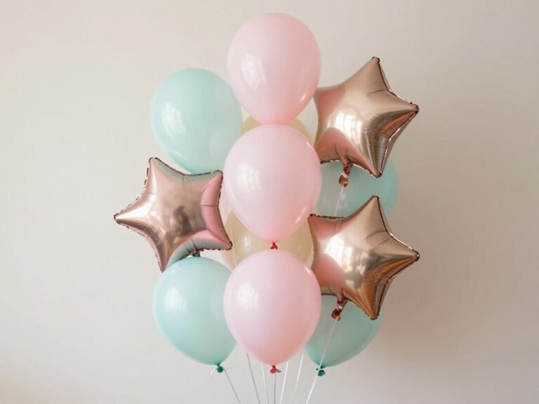
Balloon bouquets transform ordinary spaces into extraordinary celebrations. Whether you’re planning a birthday party, wedding reception, baby shower, or corporate event, the right balloon arrangement adds that perfect touch of festivity and joy. These versatile decorations offer endless possibilities for creativity. From simple color combinations to elaborate themed designs, balloon bouquets suit every occasion and…
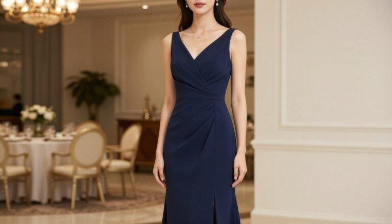
Receiving an invitation to a formal wedding brings both excitement and the inevitable question: “What should I wear?” Finding the perfect formal wedding guest dress requires understanding dress codes, seasonal considerations, and wedding etiquette. This comprehensive guide will help you navigate the world of formal wedding attire, ensuring you look sophisticated and appropriate while honoring…
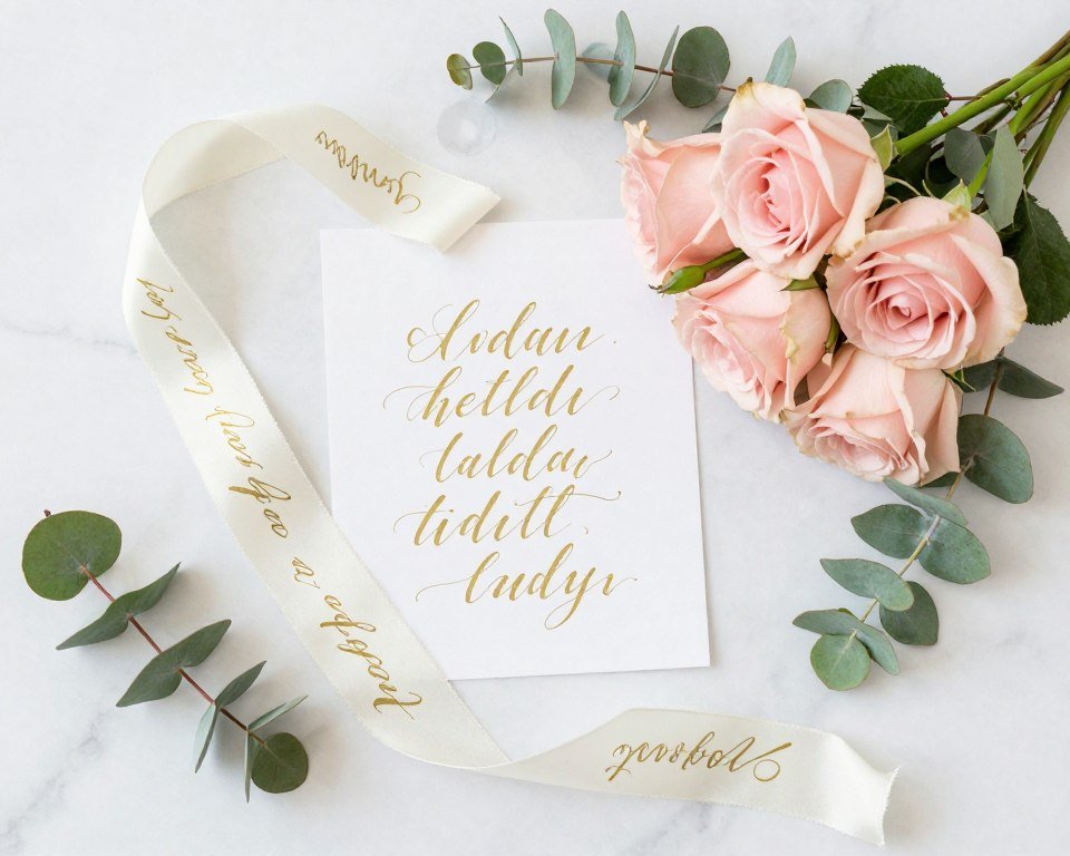
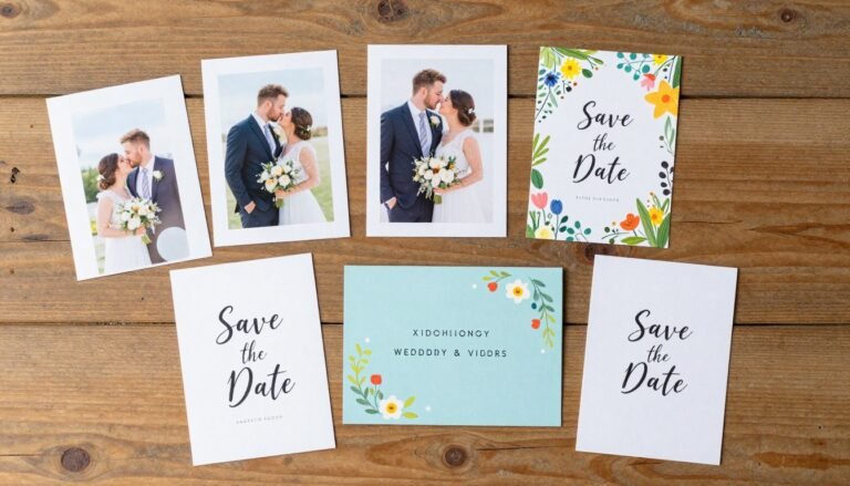
Your wedding date deserves an announcement as special as your love story. Save the dates set the tone for your big day and give guests time to mark their calendars. The right save date can build anticipation and reflect your unique personality as a couple. Whether you prefer classic elegance or playful creativity, there’s a…
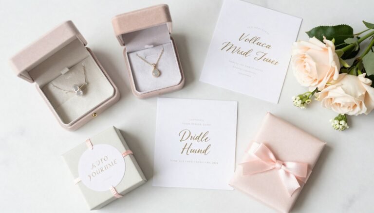
Your bridesmaids stand beside you on your big day. They help plan your bridal shower and support you through wedding planning stress. These special girls deserve thoughtful bridesmaid gifts that celebrate your friendship. Finding the perfect bridesmaid gift can feel overwhelming. You want something meaningful that fits your budget. The right gift shows appreciation for…
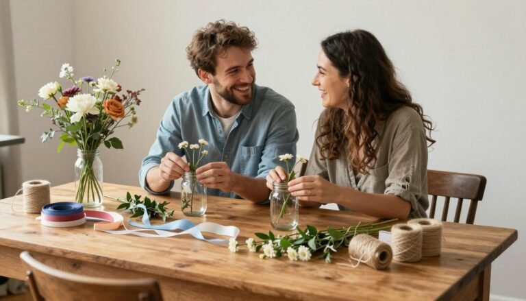
Planning your wedding is an exciting journey, and creating your own DIY wedding decorations adds a personal touch while helping you stay within budget. Whether you’re dreaming of a rustic barn celebration, an elegant garden affair, or a bohemian-inspired gathering, handcrafted elements can transform your venue into something truly magical that reflects your unique love…
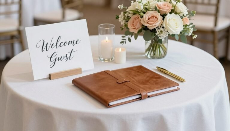
Your guest book table is more than just a functional space—it’s one of the first impressions guests have of your special day. This thoughtfully designed area welcomes loved ones while preserving their heartfelt messages for years to come. Whether you’re planning a wedding, anniversary celebration, or milestone birthday, the perfect guest book table decor transforms…