Wedding Ideas Color Schemes: Your Complete Guide to Perfect Palette Selection
Selecting the right wedding color palette transforms your celebration from ordinary to extraordinary. Your color scheme sets the mood for your big day and creates visual harmony across every detail. From invitations to centerpieces, the hues you choose tell your unique love story.
This comprehensive guide explores stunning wedding color schemes across seasons and styles. You’ll discover how different shades work together to create breathtaking combinations. Whether you’re drawn to soft pastels or bold jewel tones, the perfect palette awaits.
Finding color inspiration feels overwhelming with endless options available. We’ve curated proven combinations that wedding planners and designers trust. Each palette includes practical tips for bringing your vision to life within any budget.
Understanding Color Theory for Your Wedding Day
Color theory provides the foundation for selecting harmonious wedding palettes. Understanding how hues interact helps you create sophisticated combinations that please the eye. The color wheel serves as your guide to discovering which shades complement each other naturally.
Complementary colors sit opposite each other on the wheel and create vibrant contrast. Think navy blue paired with warm gold accents for dramatic impact. Analogous colors neighbor each other and produce gentle, flowing transitions between shades.
The 60-30-10 rule creates balance in your wedding design. Choose one dominant color for 60 percent of your décor, a secondary shade for 30 percent, and an accent hue for the remaining 10 percent. This proportion prevents visual chaos while maintaining interest.
Warm Versus Cool Tones
Warm tones include reds, oranges, and yellows that evoke energy and passion. These hues work beautifully for autumn celebrations and create intimate, cozy atmospheres. Cool tones like blues, greens, and purples bring calmness and elegance to your wedding venue.
Related Posts:



Mixing warm and cool creates dynamic tension that captivates guests. A sage green base with terracotta accents balances freshness with warmth. Consider your venue’s existing colors when selecting your temperature preference.
Neutral Foundations
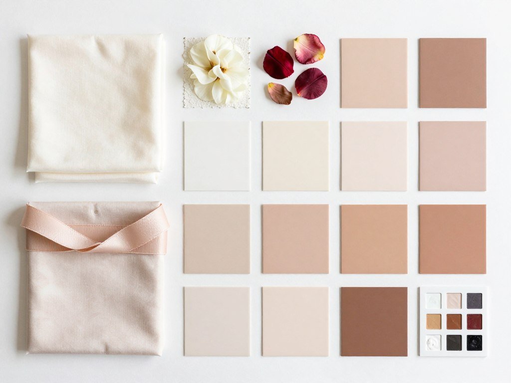
Neutral shades provide flexibility and timeless appeal for any wedding style. Ivory, champagne, taupe, and gray serve as perfect backdrops for bolder accent colors. These versatile hues never compete with your wedding dress or venue architecture.
Layering different neutral tones adds depth without introducing competing colors. Combine cream linens with beige napkins and soft gray chargers for sophisticated texture. Metallics like gold, silver, and rose gold count as neutrals that add glamour.
Spring Wedding Color Palettes That Celebrate New Life
Spring wedding palettes mirror nature’s renewal with fresh, optimistic hues. This season invites soft pastels and vibrant garden-inspired combinations. Your spring color scheme should feel light, airy, and full of possibility.
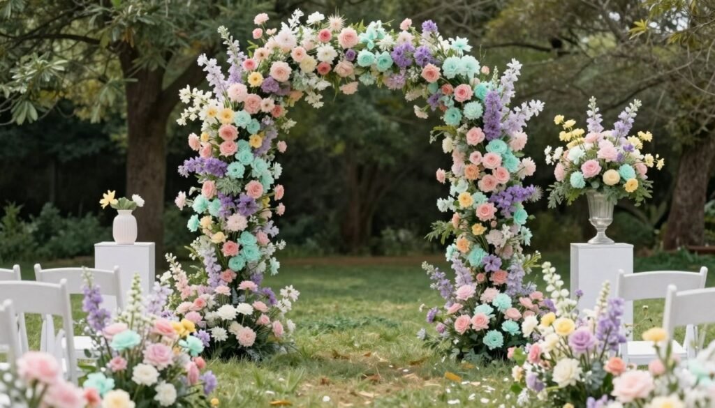
Blush Pink and Sage Green
This romantic combination captures spring’s gentle beauty perfectly. Blush pink brings warmth and femininity while sage green adds natural freshness. The pairing works beautifully for garden ceremonies and rustic barn receptions alike.
Use blush for your bridesmaid dresses and floral arrangements as your dominant shade. Incorporate sage through table runners, foliage, and groomsmen ties. Add touches of cream and gold for elevated sophistication.
This palette photographs beautifully in natural light and flatters all skin tones. The soft hues create a dreamy, ethereal mood that guests remember. Consider eucalyptus garlands and rose centerpieces to bring this color story together.
Create Your Blush and Sage Wedding
Transform your spring celebration with coordinated décor in these romantic hues. Find everything from table linens to ceremony backdrops.
Lavender and Lemon Yellow
This cheerful pairing energizes your spring wedding with playful sophistication. Lavender provides calming elegance while lemon yellow injects sunshine and joy. Together they create visual interest without overwhelming your space.
Feature lavender in your floral arrangements and bridesmaid bouquets as your primary wedding color. Introduce lemon accents through napkins, signage, and cake details. Crisp white serves as the perfect neutral foundation for this vibrant duo.
The combination works exceptionally well for morning and afternoon celebrations. Natural light enhances both hues and creates stunning photo opportunities. This palette suits both formal ballrooms and casual outdoor venues.
Coral and Mint
This fresh combination balances warmth with coolness for spring versatility. Coral adds vibrant energy and modern flair to traditional wedding palettes. Mint green brings refreshing contrast that prevents the look from feeling too bold.
Use coral for statement pieces like your wedding cake and seating chart. Let mint dominate through linens, bridesmaid dresses, and ceremony décor. Gold accents add luxury and tie the palette together beautifully.
This color scheme transitions seamlessly from spring into early summer celebrations. The hues complement both vintage and contemporary wedding styles. Consider ranunculus, peonies, and succulents in your floral arrangements.
Summer Wedding Color Schemes for Sun-Filled Celebrations
Summer weddings call for bold, confident color palettes that match the season’s energy. Vibrant hues and tropical-inspired combinations shine under bright sunshine. Your summer wedding color scheme should feel joyful, saturated, and alive.
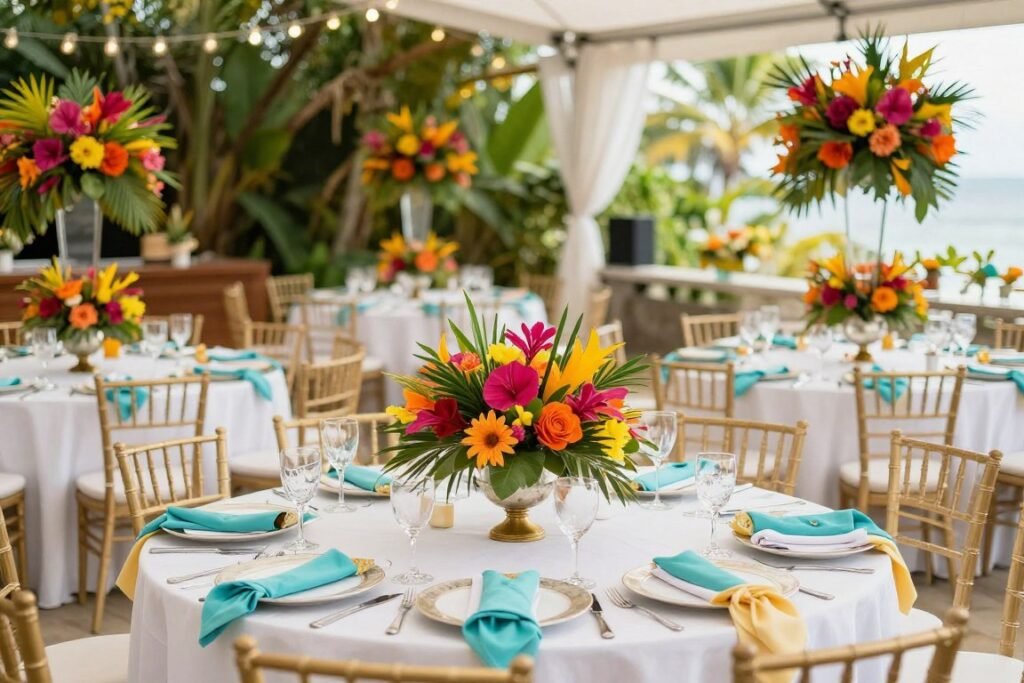
Navy Blue and Coral
This classic nautical-inspired palette never goes out of style for summer nuptials. Navy blue provides sophisticated depth and anchors the design. Coral adds warmth and prevents the look from feeling too masculine or serious.
Feature navy through groomsmen suits, table linens, and invitation suites. Use coral for bridesmaid dresses, floral arrangements, and cake accents. Crisp white and touches of gold complete this timeless combination.
The palette works beautifully for beach weddings and yacht club receptions. It photographs exceptionally well against water and sky backdrops. This combination suits both formal evening affairs and casual daytime celebrations.
Bring Your Nautical Vision to Life
Discover coordinated navy and coral wedding essentials that capture summer’s coastal charm perfectly.
Fuchsia and Orange
This bold tropical combination makes a dramatic statement for adventurous couples. Fuchsia brings electric energy and modern edge to your wedding palette. Orange adds warmth and creates stunning contrast against the pink undertones.
Balance these intense hues with plenty of white and green foliage. Let fuchsia dominate through flowers and statement décor pieces. Use orange sparingly in table numbers, welcome signs, and cocktail napkins.
This vibrant palette suits destination weddings and outdoor garden parties. The colors pop beautifully in photographs and create memorable visual impact. Consider bougainvillea, orchids, and bird of paradise in your arrangements.
Turquoise and Yellow
This sunny combination captures summer’s carefree spirit with cheerful sophistication. Turquoise evokes tropical waters and brings cooling freshness to your celebration. Bright yellow adds warmth and creates an optimistic, happy mood.
Use turquoise as your dominant wedding color through linens and bridesmaid attire. Introduce yellow through floral centerpieces, lemon décor, and cake details. White and natural wood tones ground this energetic palette.
The combination works wonderfully for beach weddings and backyard celebrations. It suits both rustic and modern wedding styles with equal charm. Sunflowers, delphiniums, and billy buttons bring this palette to life naturally.
Emerald Green and Gold
This luxurious pairing brings sophisticated glamour to summer celebrations. Emerald green offers rich depth and jewel-tone elegance. Metallic gold adds warmth and creates opulent visual interest throughout your venue.
Feature emerald in your color palette through velvet linens, lush foliage, and bridesmaid gowns. Layer in gold through chargers, flatware, candle holders, and invitation embellishments. Ivory flowers provide the perfect neutral contrast.
This combination elevates evening receptions and black-tie affairs beautifully. The hues photograph with incredible richness and depth. Consider tropical leaves, roses, and hanging amaranthus for dramatic floral impact.
Autumn Wedding Color Palettes Inspired by Fall Foliage
Autumn offers the most diverse color inspiration of any season for wedding planning. Rich jewel tones and warm earth shades create cozy, romantic atmospheres. Your fall color scheme should embrace the harvest and changing leaves.
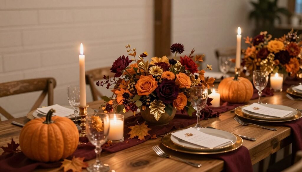
Burgundy and Gold
This regal combination epitomizes autumn elegance and timeless sophistication. Burgundy brings dramatic depth and romantic intensity to your wedding design. Metallic gold adds warmth and prevents the palette from feeling too dark or heavy.
Use burgundy for your primary wedding color through florals, linens, and bridesmaid dresses. Incorporate gold through place settings, candle holders, and invitation accents. Touches of cream and greenery soften the rich tones beautifully.
This palette suits vineyard weddings and historic venue celebrations perfectly. The colors create stunning photographs in golden hour lighting. Consider dahlias, garden roses, and amaranthus in your floral arrangements.
Create an Elegant Fall Celebration
Discover sophisticated burgundy and gold wedding décor that captures autumn’s luxurious beauty.
Burnt Orange and Sage
This earthy combination balances warmth with natural freshness for fall versatility. Burnt orange captures the season’s changing leaves and harvest celebrations. Sage green adds cooling contrast and prevents the palette from feeling too intense.
Feature burnt orange through accent flowers, table runners, and welcome signage. Let sage dominate your color palette with linens, bridesmaid attire, and foliage. Cream and natural wood elements complete this organic look.
The pairing works beautifully for outdoor celebrations and rustic barn weddings. It suits both bohemian and classic wedding styles with charm. This combination photographs gorgeously in natural autumn light.
Plum and Champagne
This sophisticated pairing delivers romantic elegance perfect for evening autumn celebrations. Deep plum provides rich color saturation and jewel-tone luxury. Champagne adds warmth and creates an upscale, refined atmosphere.
Use plum as your statement color in floral arrangements and bridesmaid gowns. Incorporate champagne through linens, candles, and subtle metallic accents. Touches of greenery and ivory flowers provide necessary contrast.
This palette elevates ballroom receptions and formal venue celebrations beautifully. The hues create moody, romantic photographs with incredible depth. Consider calla lilies, roses, and scabiosa in your arrangements.
Terracotta and Mustard
This warm, earthy combination embraces autumn’s cozy harvest spirit fully. Terracotta brings grounded, organic warmth to your wedding color palette. Mustard yellow adds unexpected brightness and contemporary edge to traditional fall colors.
Balance these rich tones with plenty of cream and natural elements. Feature terracotta in pottery vessels, table runners, and dried floral accents. Use mustard sparingly through napkins, signage, and bridesmaid bouquet ribbons.
The palette suits bohemian outdoor weddings and desert celebrations perfectly. It works exceptionally well with macramé, pampas grass, and organic textures. This combination feels fresh and modern while honoring fall traditions.
Winter Wedding Color Schemes for Magical Celebrations
Winter weddings allow for dramatic, moody palettes that embrace the season’s elegance. Deep jewel tones and icy metallics create enchanting atmospheres. Your winter color scheme should feel luxurious, cozy, and magical.
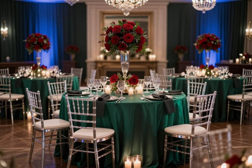
Emerald and Silver
This festive combination brings sophisticated holiday charm to winter nuptials. Rich emerald green provides depth and jewel-tone elegance throughout your venue. Metallic silver adds icy sparkle and prevents the look from feeling too heavy.
Feature emerald through velvet linens, lush greenery garlands, and bridesmaid gowns. Layer in silver with mercury glass votives, flatware, and delicate invitation details. Crisp white flowers provide the perfect snowy contrast.
This palette photographs beautifully with twinkling lights and candlelight. It suits both traditional and modern wedding styles with equal grace. The combination works wonderfully for December and January celebrations.
Design Your Winter Wonderland
Find elegant emerald and silver wedding décor that transforms your venue into a magical celebration space.
Navy and Blush with Gold
This romantic trio balances sophistication with softness for winter versatility. Navy blue anchors the design with rich depth and timeless appeal. Blush pink adds warmth and prevents the palette from feeling too cold or masculine.
Use navy as your dominant shade through groomsmen attire and invitation suites. Feature blush in florals, bridesmaid dresses, and cake design details. Gold accents tie everything together with luxurious warmth.
The combination suits both formal ballrooms and intimate winter venues perfectly. It photographs with incredible richness in low winter light. This palette feels fresh and modern while maintaining classic elegance.
Burgundy and Navy
This bold, moody combination creates dramatic impact for confident couples. Deep burgundy brings romantic intensity and jewel-tone richness to your wedding design. Navy blue adds sophisticated depth and grounds the warm tones beautifully.
Balance these dark hues with plenty of metallic gold and ivory accents. Feature burgundy in floral arrangements and accent décor pieces. Use navy through linens, groomsmen attire, and invitation designs.
This palette elevates industrial venues and historic spaces with drama. The colors create stunning contrast in photographs with depth and dimension. Consider ranunculus, anemones, and garden roses in your arrangements.
Ice Blue and Silver
This ethereal combination captures winter’s frosty beauty with delicate sophistication. Pale ice blue evokes snowy landscapes and creates serene, peaceful atmospheres. Metallic silver adds sparkle and enhances the wintery theme perfectly.
Use ice blue as your primary wedding color through linens and bridesmaid gowns. Incorporate silver through mercury glass, sequin accents, and metallic invitations. White flowers and crystal elements complete this frozen wonderland look.
The palette suits snowy destination weddings and elegant ballroom receptions. It photographs beautifully with winter light and creates magical memories. This combination feels romantic and dreamy without being overly traditional.
Classic Timeless Wedding Color Palettes
Some wedding color combinations transcend seasonal trends and remain perpetually elegant. These timeless palettes work beautifully year-round and suit any venue style. Classic color schemes provide sophisticated backdrops that never feel dated in photographs.
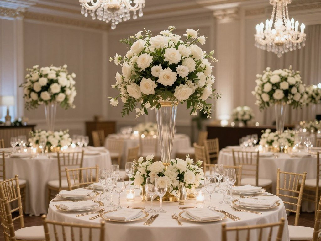
All White with Greenery
This pure, elegant palette showcases natural beauty with minimal color distraction. Crisp white creates clean, sophisticated backdrops that highlight architectural details. Lush greenery adds organic texture and prevents the look from feeling sterile.
Feature white through florals, linens, candles, and ceremony décor elements. Incorporate various shades of green through garlands, potted plants, and foliage accents. Touches of gold or silver add subtle glamour without competing.
This combination suits garden weddings and modern minimalist celebrations equally well. It photographs beautifully and creates timeless images you’ll treasure forever. The palette allows your dress and venue to shine as focal points.
Ivory and Champagne
This soft, romantic duo delivers warmth and sophistication without bold color. Ivory provides a gentle foundation that flatters all skin tones beautifully. Champagne adds subtle richness and creates luxurious depth throughout your venue.
Layer different textures in these neutral tones for visual interest and dimension. Use ivory for your primary linens and floral choices in your color palette. Introduce champagne through ribbons, candles, and delicate metallic accents.
The palette works year-round and suits both formal and casual wedding styles. It creates elegant, cohesive designs that feel sophisticated and refined. This combination never competes with your wedding dress or venue architecture.
Black and White with Gold
This bold, graphic combination delivers modern sophistication with timeless appeal. Black and white create striking contrast and architectural interest. Metallic gold adds warmth and prevents the look from feeling too stark.
Use black sparingly through groomsmen attire, invitation accents, and graphic signage. Feature white as your dominant shade in florals and linens. Layer gold through chargers, flatware, and candle holders for luxury.
This palette suits art deco venues and contemporary celebrations perfectly. It photographs with incredible drama and creates memorable visual impact. The combination works beautifully for black-tie evening receptions.
Shop Timeless Wedding Elegance
Discover classic wedding décor in sophisticated neutral tones that never go out of style.
Bohemian Wedding Color Palettes for Free-Spirited Celebrations
Bohemian weddings embrace natural, earthy tones mixed with unexpected pops of color. These palettes feel organic, relaxed, and full of personality. Your boho color scheme should celebrate nature and artistic freedom.
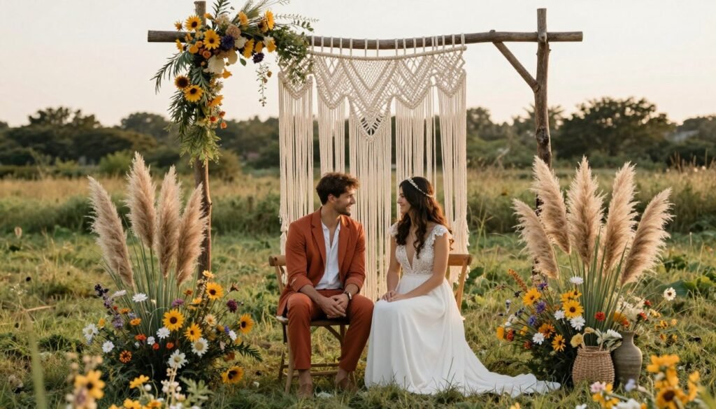
Terracotta and Dusty Blue
This earthy combination balances warmth with coolness for bohemian versatility. Terracotta brings grounded, organic warmth that connects to desert landscapes. Dusty blue adds unexpected softness and prevents the palette from feeling too intense.
Feature terracotta through pottery vessels, table runners, and dried floral elements. Use dusty blue in bridesmaid dresses, napkins, and delicate ribbon accents. Natural wood, cream, and pampas grass complete this organic look.
The palette suits outdoor celebrations and desert weddings beautifully. It works wonderfully with macramé, vintage rugs, and organic textures. This combination feels contemporary while honoring bohemian traditions.
Mauve and Sage
This soft, romantic pairing captures bohemian elegance with gentle sophistication. Muted mauve provides dusty pink warmth without feeling too sweet. Sage green adds natural freshness and creates calming, peaceful atmospheres.
Use mauve for your floral arrangements and accent décor in your color palette. Let sage dominate through linens, foliage, and bridesmaid attire choices. Touches of cream, beige, and natural elements ground the look.
This combination photographs beautifully in natural light with soft, dreamy quality. It suits garden ceremonies and rustic barn receptions equally well. The palette feels feminine without being overly traditional or formal.
Rust and Mustard with Cream
This warm, autumnal trio embraces bohemian spirit with earthy confidence. Rich rust brings organic depth and harvest-inspired warmth to your celebration. Mustard yellow adds brightness and creates cheerful, optimistic energy throughout.
Balance these saturated tones with plenty of cream and natural textures. Feature rust in dried floral arrangements, table linens, and pottery elements. Use mustard sparingly through napkins, signage, and bouquet accents.
The palette works beautifully for outdoor fall weddings and desert celebrations. It suits both casual and semi-formal wedding styles with personality. This combination feels bohemian while maintaining sophisticated polish.
Modern Contemporary Wedding Color Palettes
Contemporary weddings embrace bold choices and unexpected color combinations. Modern palettes often feature high contrast and graphic elements. Your contemporary color scheme should feel fresh, confident, and design-forward.
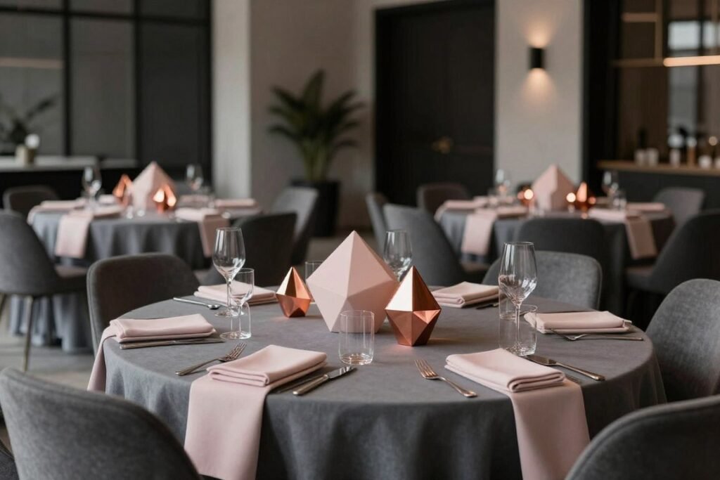
Charcoal Gray and Blush
This sophisticated pairing balances masculine strength with feminine softness perfectly. Deep charcoal gray provides modern edge and graphic contrast in your wedding design. Soft blush pink adds warmth and prevents the look from feeling too industrial.
Use charcoal for groomsmen suits, invitation designs, and accent furniture pieces. Feature blush in florals, bridesmaid dresses, and delicate décor details. Metallic copper or rose gold ties the palette together beautifully.
The combination suits urban loft venues and contemporary spaces exceptionally well. It photographs with incredible depth and modern sophistication. This palette appeals to couples seeking elegance without traditional formality.
Black and Fuchsia
This bold, dramatic combination makes powerful statements for confident couples. Crisp black creates graphic impact and modern architectural interest. Electric fuchsia adds vibrant energy and prevents the design from feeling too serious.
Balance these intense hues carefully to avoid overwhelming your venue space. Use black sparingly through table numbers, invitation accents, and groomsmen details. Let fuchsia shine in floral arrangements and statement décor pieces.
This palette suits modern art galleries and contemporary celebration venues perfectly. It creates stunning photographs with bold visual impact and energy. The combination works beautifully for evening receptions and cocktail parties.
Teal and Copper
This rich, jewel-toned pairing delivers modern luxury with warmth. Deep teal provides saturated color and sophisticated depth throughout your venue. Metallic copper adds warmth and creates on-trend metallic interest.
Feature teal as your primary wedding color through linens and bridesmaid attire. Incorporate copper through geometric centerpiece holders, flatware, and invitation foil. Touches of cream and greenery soften the bold tones.
The palette photographs beautifully with rich, saturated color and dimension. It suits both industrial and elegant modern venues with equal charm. This combination feels contemporary while maintaining timeless appeal.
Create Your Modern Celebration
Find contemporary wedding décor in bold, sophisticated color combinations that make design statements.
Romantic Garden Wedding Color Palettes
Garden weddings call for soft, floral-inspired color combinations that complement natural surroundings. These palettes embrace nature’s beauty with gentle, romantic hues. Your garden color scheme should enhance rather than compete with outdoor blooms.
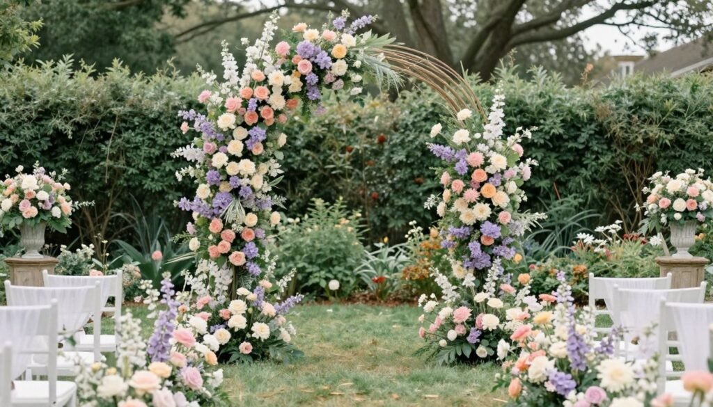
Peach and Lavender
This dreamy combination captures garden romance with gentle sophistication. Soft peach brings warmth and creates glowing, sunset-inspired atmospheres. Delicate lavender adds cooling contrast and prevents the palette from feeling too warm.
Use peach for your dominant floral choices and accent décor elements. Incorporate lavender through bridesmaid dresses, napkins, and ceremony details. Cream, white, and soft greenery complete this garden-perfect look.
The palette photographs beautifully in natural garden light with soft, romantic quality. It suits outdoor ceremonies and tented receptions exceptionally well. This combination feels fresh and feminine without being overly sweet.
Soft Pink and Ivory
This classic romantic duo never fails to create elegant garden atmospheres. Gentle pink provides warmth and traditional romantic appeal throughout your celebration. Ivory adds creamy richness and prevents the look from feeling too monochromatic.
Layer different shades of pink from blush to rose for dimensional interest. Feature ivory in linens, candles, and supporting floral elements. Touches of gold and greenery add subtle sophistication to the soft palette.
This combination suits both formal gardens and casual backyard weddings beautifully. It creates timeless photographs that feel romantic and elegant forever. The palette works year-round with seasonal flower choices.
Lilac and Butter Yellow
This cheerful pairing brings garden freshness with unexpected color personality. Soft lilac provides gentle purple tones that complement garden blooms naturally. Butter yellow adds sunshine warmth and creates optimistic, happy energy.
Use lilac as your primary shade through florals and bridesmaid attire. Introduce butter yellow through table linens, lemon accents, and signage details. White and greenery balance these lovely spring-inspired hues.
The palette works wonderfully for morning and afternoon garden celebrations. It photographs with beautiful soft tones and cheerful warmth. This combination suits both traditional and whimsical wedding styles.
Jewel Tone Wedding Color Palettes for Luxurious Celebrations
Jewel tones bring rich, saturated color that creates dramatic, luxurious atmospheres. These deep hues work beautifully for evening celebrations and formal venues. Your jewel-tone palette should feel opulent, sophisticated, and memorable.
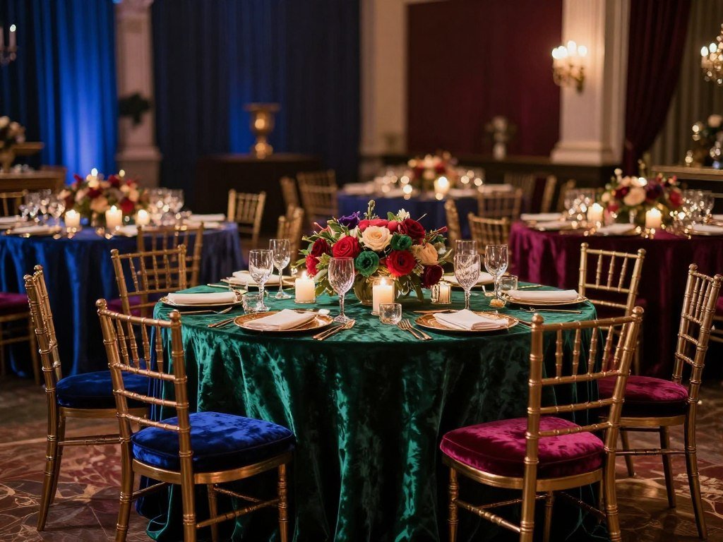
Sapphire Blue and Amethyst
This regal combination delivers jewel-box elegance with royal sophistication. Deep sapphire blue provides rich, saturated color that commands attention. Amethyst purple adds complementary depth and creates luxurious visual interest.
Feature sapphire through velvet linens, invitation designs, and groomsmen accents. Use amethyst in floral arrangements and bridesmaid gown choices. Metallic gold and silver details enhance the jewel-tone richness beautifully.
The palette suits evening receptions and ballroom celebrations exceptionally well. It photographs with incredible depth and dramatic sophistication. This combination works wonderfully for winter and fall weddings.
Emerald and Ruby
This bold, festive pairing creates dramatic impact with jewel-tone intensity. Rich emerald green provides depth and luxurious color saturation. Ruby red adds warmth and prevents the palette from feeling too cool.
Balance these intense hues with plenty of gold metallics and cream accents. Use emerald for your dominant décor in linens and lush foliage. Feature ruby sparingly in floral accents and statement pieces for impact.
This palette elevates holiday weddings and creates memorable visual drama. The colors photograph richly and create stunning contrast together. The combination suits both traditional and modern celebration styles.
Plum and Teal
This sophisticated duo balances cool and warm jewel tones beautifully. Deep plum provides rich purple saturation with romantic elegance. Teal adds unexpected contrast and creates modern visual interest.
Feature plum as your primary wedding color through florals and bridesmaid attire. Incorporate teal through accent linens, signage, and groomsmen accessories. Gold and cream details tie this unique palette together perfectly.
The combination works beautifully for fall and winter celebrations with richness. It suits both bohemian and formal wedding styles with personality. This palette photographs with beautiful depth and dimensional color.
Design Your Jewel-Toned Celebration
Discover rich, luxurious wedding décor in saturated jewel tones that create unforgettable atmospheres.
Tropical Destination Wedding Color Palettes
Destination weddings in tropical locations invite vibrant, bold color choices. These palettes celebrate exotic blooms and ocean-inspired hues. Your tropical color scheme should feel energetic, festive, and vacation-inspired.
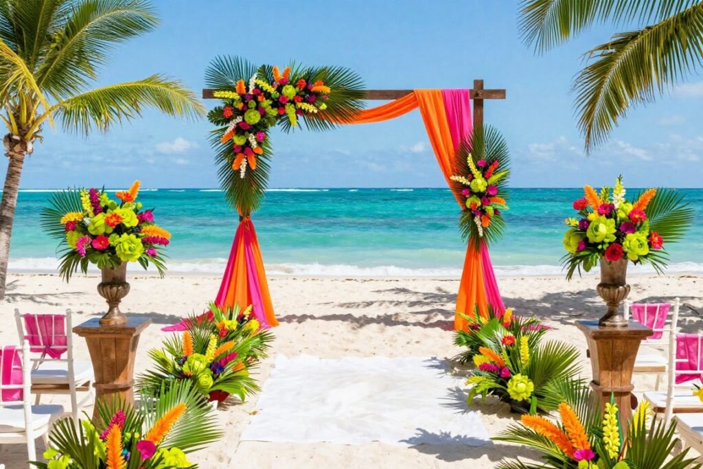
Hot Pink and Orange
This electric combination captures tropical energy with fearless confidence. Vibrant hot pink creates bold statements and modern tropical flair. Bright orange adds warmth and enhances the festive vacation atmosphere.
Balance these intense hues with white, cream, and natural wood elements. Feature hot pink in bougainvillea arrangements and statement décor pieces. Use orange through tropical blooms, table linens, and accent details.
The palette suits beach ceremonies and resort receptions with personality. It photographs beautifully against ocean and palm tree backdrops. This combination works wonderfully for couples seeking vibrant celebration energy.
Turquoise and Coral
This classic tropical duo never fails to create beachy, festive atmospheres. Bright turquoise evokes crystal-clear waters and tropical ocean beauty. Coral adds warmth and creates perfect contrast with cooling blue tones.
Use turquoise as your dominant shade through linens and ceremony accents. Feature coral in floral arrangements, bridesmaid dresses, and invitation designs. White, cream, and touches of gold complete this beach-perfect look.
The combination photographs exceptionally well in tropical sunlight and settings. It suits both casual beach weddings and elegant resort celebrations. This palette feels vacation-inspired while maintaining sophisticated appeal.
Lime Green and Fuchsia
This bold, energetic pairing delivers tropical drama with playful sophistication. Vibrant lime green brings fresh energy and unexpected color personality. Electric fuchsia adds intensity and creates memorable visual impact.
Balance these saturated tones with plenty of white and natural elements. Use lime green through tropical foliage, table runners, and groomsmen ties. Feature fuchsia in orchid arrangements and statement décor pieces for drama.
The palette works beautifully for destination weddings with adventurous couples. It creates stunning photographs with bold, vibrant tropical energy. This combination suits both daytime and evening beach celebrations.
Rustic Barn Wedding Color Palettes
Barn weddings call for warm, natural color palettes that complement wooden settings. These combinations embrace organic textures and country-inspired charm. Your rustic color scheme should feel grounded, cozy, and authentically natural.
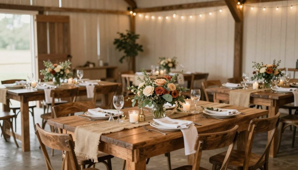
Cream and Sage
This soft, organic combination creates peaceful rustic elegance perfectly. Warm cream provides neutral foundation that complements natural wood beautifully. Sage green adds freshness and connects your celebration to nature.
Feature cream through linens, candles, and supporting floral elements throughout. Use sage for your primary color in bridesmaid dresses and foliage accents. Natural wood, burlap, and twine complete this rustic-chic look.
The palette photographs beautifully in barn settings with soft, romantic quality. It works year-round and suits both casual and semi-formal celebrations. This combination feels timeless while embracing rustic charm.
Dusty Blue and Peach
This gentle pairing balances coolness with warmth for rustic versatility. Muted dusty blue provides sophisticated color without competing with barn architecture. Soft peach adds warmth and prevents the look from feeling too cool.
Use dusty blue as your dominant shade through linens and bridesmaid attire. Incorporate peach in floral arrangements, napkins, and cake design details. Cream, wood, and greenery ground this lovely rustic palette.
The combination suits spring and summer barn weddings exceptionally well. It photographs with beautiful soft tones and dimensional color. This palette feels romantic and fresh while honoring rustic traditions.
Burgundy and Cream
This rich, classic duo creates warm rustic elegance for any season. Deep burgundy brings sophistication and romantic depth to barn settings. Cream adds lightness and prevents the space from feeling too dark.
Feature burgundy in your floral arrangements and accent décor elements. Use cream for your primary linens and supporting details throughout. Touches of gold, wood, and greenery enhance the rustic sophistication.
The palette works beautifully for fall and winter barn celebrations especially. It creates cozy, romantic atmospheres that guests remember fondly. This combination photographs with rich warmth and timeless appeal.
Bring Your Rustic Vision to Life
Find authentic rustic wedding décor that complements natural barn settings with organic charm.
Implementing Your Wedding Color Palette Successfully
Selecting beautiful colors represents just the beginning of your design journey. Successful implementation requires strategic planning and thoughtful coordination across all details. Your color palette should flow seamlessly from invitations through reception.
Start with Major Elements
Begin implementing your wedding color scheme with the largest visual elements first. Your bridesmaid dresses, groomsmen attire, and ceremony backdrop set the foundation. Table linens and floral arrangements represent significant color investments that anchor your design.
Select these primary elements in your dominant color for cohesive impact. Leave accent colors for smaller details that provide visual interest. This approach prevents color overload and maintains sophisticated balance.
Your venue’s existing colors influence how your palette appears in reality. Visit your space in similar lighting to your wedding day timing. Bring fabric swatches to see how your chosen hues interact with architectural elements.
Layer in Accent Details
Once major elements are established, introduce accent colors through smaller details. Napkins, ribbons, signage, and cake accents provide perfect accent opportunities. These touches reinforce your palette without overwhelming the overall design.
Use the 60-30-10 rule to maintain visual balance and harmony. Your dominant color should appear most frequently across all wedding elements. Secondary and accent hues provide interest without creating visual competition.
Don’t feel pressured to include every color in every single detail. Strategic placement creates more sophisticated impact than forced coordination everywhere. Allow some elements to remain neutral for breathing room.
Consider Lighting Effects
Your chosen colors will appear different under various lighting conditions throughout your day. Natural sunlight, golden hour glow, and evening candlelight all affect color perception. Test your palette in lighting similar to your wedding timing.
Darker jewel tones may appear nearly black in low light without proper illumination. Soft pastels can wash out completely under harsh fluorescent venue lighting. Plan your color choices with your venue’s lighting characteristics in mind.
Strategic lighting enhances your color palette and creates desired atmospheres. Uplighting in your accent color transforms plain walls into design elements. Candlelight adds warmth to any color scheme and creates romantic ambiance.
Coordinate with Vendors
Share your complete color palette with every vendor early in planning. Provide specific color names, swatches, and visual examples for clarity. This prevents misinterpretation and ensures everyone works toward the same vision.
Your florist needs exact color specifications for ordering flowers months ahead. Cake designers benefit from ribbon samples to match frosting perfectly. Stationery designers require precise color codes for printing accuracy.
Create a mood board with photos, swatches, and paint chips for reference. Digital boards work well for sharing with distant vendors electronically. Physical boards help during in-person meetings and venue walkthroughs.
Budget-Friendly Ways to Implement Your Color Palette
Creating stunning color coordination doesn’t require unlimited budgets or extravagant spending. Strategic choices and DIY elements achieve beautiful results within modest means. Smart couples prioritize where color investment matters most for visual impact.
Focus Color on High-Impact Areas
Concentrate your color budget where guests spend the most time looking. Your ceremony backdrop and reception centerpieces deserve the majority of your color investment. These focal points create the strongest impression in memories and photographs.
Table settings offer excellent color impact for relatively modest investment. Colored napkins cost little but create significant visual coordination across your venue. Runners, chargers, and small floral touches deliver color without premium pricing.
Skip expensive colored linens and use affordable white as your foundation. Add color through overlays, runners, and napkins at fraction of the cost. This approach provides flexibility and reduces rental expenses significantly.
DIY Color Elements
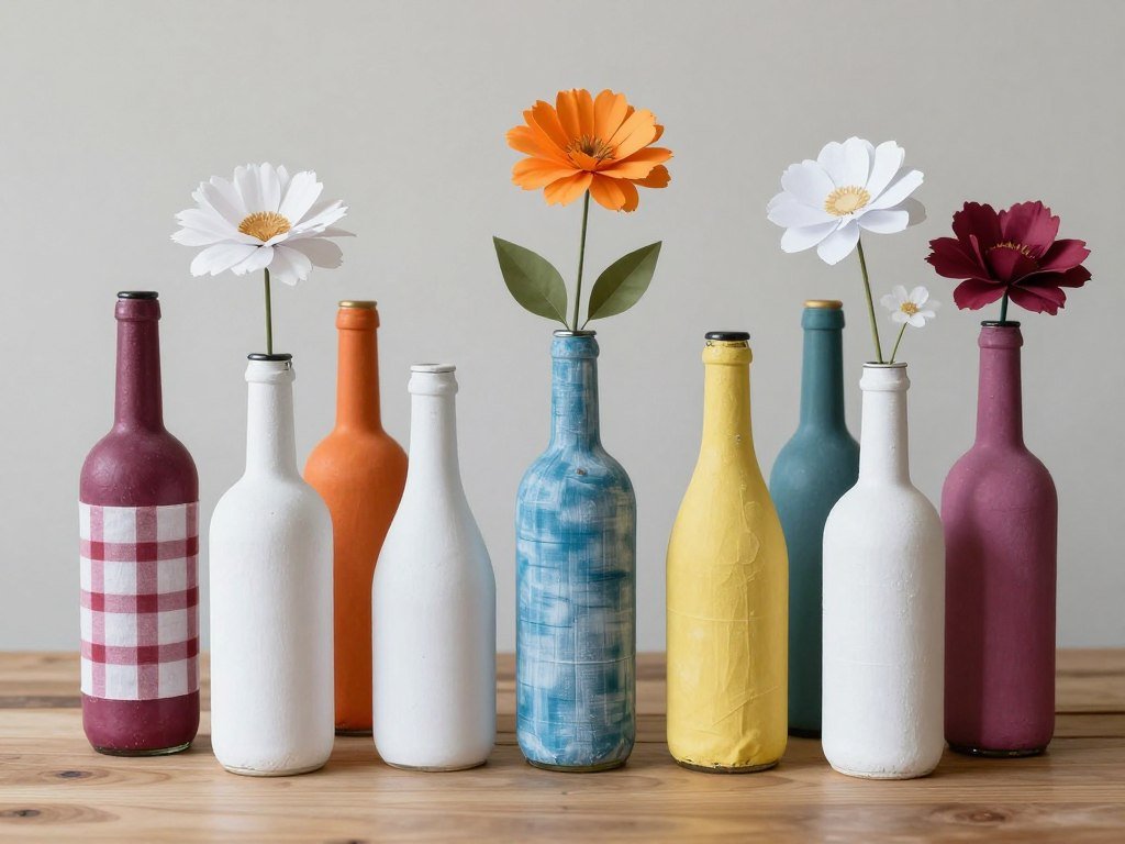
Handmade details allow precise color control while saving money on your celebration. Painted bottles, dyed fabrics, and paper flowers achieve exact color matches. These personal touches add meaning beyond their visual contribution to your day.
Spray paint transforms thrift store finds into coordinated décor pieces affordably. Gold, copper, or colored spray paint unifies mismatched items into cohesive collections. Mason jars, picture frames, and candle holders become design elements inexpensively.
Paper flowers offer budget-friendly color control unavailable with fresh blooms. Crepe paper, tissue, or cardstock creates stunning arrangements in any shade. These never wilt and can be made months ahead without concern.
Use Colored Lighting
Uplighting transforms plain venues into color-coordinated spaces for reasonable rental fees. Colored LED lights wash walls in your chosen hues without permanent changes. This dramatic effect costs far less than extensive floral installations.
String lights in colored bulbs add festive atmosphere without significant expense. These work beautifully for outdoor celebrations and rustic barn venues. The warm glow creates ambiance while reinforcing your color story.
Colored candles provide affordable tabletop color that also serves functional purposes. Pillar candles, votives, and tapers come in every imaginable shade. These create romantic lighting while reinforcing your palette throughout your venue.
Shop Budget-Friendly Color Coordination
Discover affordable wedding décor solutions that deliver beautiful color impact without breaking your budget.
Common Wedding Color Palette Mistakes to Avoid
Even experienced planners sometimes make color selection errors that impact overall design. Learning from common mistakes helps you avoid costly coordination problems later. Awareness of these pitfalls creates smoother planning and better results.
Choosing Too Many Colors
The most frequent mistake involves including too many competing colors in one palette. More than four or five colors creates visual chaos rather than cohesion. Your venue begins to look like a rainbow exploded rather than intentional design.
Limit your palette to one dominant color, one or two secondary shades, and one accent. This restriction forces thoughtful choices and creates sophisticated results. Remember that neutrals like white, cream, and gold don’t count toward your color limit.
Every additional color requires coordination across more elements and vendors. Complexity increases costs and creates more opportunities for mismatches. Simpler palettes photograph better and create more elegant, timeless results.
Ignoring Seasonal Availability
Selecting colors without considering seasonal flower availability creates budget problems. Out-of-season blooms cost significantly more and may require costly substitutions. Your florist cannot always source exact shades regardless of budget.
Research which flowers naturally bloom in your wedding season’s color palette. Work with nature rather than against it for best pricing and freshest blooms. Seasonal flowers also photograph more beautifully and last longer throughout your celebration.
Flexibility with specific shades within your color family prevents disappointment. “Blush pink” encompasses many variations that your florist can source seasonally. Exact Pantone matching proves nearly impossible with natural organic materials.
Forgetting About Skin Tones
Colors that look beautiful on mood boards may not flatter your wedding party. Certain shades wash out pale complexions or clash with deeper skin tones. Your bridesmaid dress color should make everyone feel confident and beautiful.
Test potential bridesmaid colors against different skin tones before committing. What flatters one person may not work for another in your party. Universal flattering shades include dusty blue, sage green, and soft mauve tones.
Consider allowing slight shade variations within your color family for different skin tones. This flexibility lets each bridesmaid wear the most flattering version. The slight variation appears intentional and sophisticated in photographs.
Matching Too Perfectly
Overly coordinated color matching creates stiff, artificial-looking results without dimension. Slight variation within your color family adds depth and visual interest. Natural flowers will never match synthetic fabrics exactly regardless of effort.
Embrace subtle tonal variations as sophistication rather than mistakes or failures. Different textures reflect light differently and naturally create color variations. This organic quality makes your design feel more natural and less forced.
Focus on coordinating undertones rather than exact shade matching across all elements. Cool undertones work together harmoniously even in different colors. This approach creates cohesive results with more relaxed, elegant appeal.
Personalizing Your Wedding Color Palette
Your color choices should reflect your unique personality and love story authentically. Generic palettes feel impersonal and fail to capture what makes you special. Thoughtful personalization creates meaningful designs that feel genuinely yours.
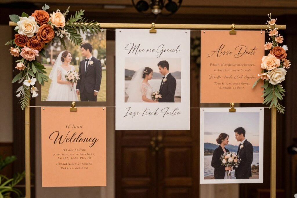
Draw Inspiration from Meaningful Places
Your favorite vacation destination provides natural color palette inspiration and meaning. Beach sunsets, mountain vistas, and city skylines offer beautiful color combinations. These personally significant places create color stories unique to your relationship.
Where did you get engaged or share memorable moments together? The colors of that special location honor your journey as a couple. Mediterranean blues and whites, tropical brights, or desert earth tones all tell stories.
Your childhood homes or places you grew up offer sentimental color inspiration. Grandmother’s garden flowers or your family beach house colors add generational meaning. These choices create conversation and connect celebration to personal history.
Incorporate Cultural Heritage
Traditional colors from your cultural backgrounds add meaningful depth to modern celebrations. Chinese red symbolizes luck, Indian gold represents prosperity, and Irish green honors heritage. These colors connect your wedding to family traditions and history.
Research the symbolic meanings of colors within your cultural traditions carefully. Some hues represent celebration while others indicate mourning in different cultures. Understanding these nuances prevents unintentional cultural missteps or offense.
Blend cultural color traditions from both families for inclusive celebration design. This fusion honors both backgrounds while creating something new and unique. Your color palette becomes a visual representation of your combined heritage.
Reflect Shared Interests
Hobbies and passions you share provide excellent color inspiration opportunities. Book lovers might choose library-inspired burgundy and gold tones. Music enthusiasts could embrace concert venue blacks with neon accent colors.
Your professional fields or academic backgrounds offer sophisticated color direction. Medical professionals might choose healing blues and greens with meaning. Teachers could embrace autumn harvest tones representing knowledge and growth.
Favorite sports teams provide ready-made color palettes with built-in significance. Elevate team colors through sophisticated styling and upscale execution. Navy and orange becomes nautical elegance rather than sports bar casual.
Consider Birth Flowers and Stones
Your birth month flowers and gemstones offer personalized color starting points. January garnet inspires deep burgundy, while September sapphire suggests rich blue tones. These personally meaningful colors add layers of significance to your celebration.
Combine birth flowers from both partners for unique blended color inspiration. Your birth months might suggest unexpected but beautiful color combinations. This approach creates truly personal palettes unavailable in generic inspiration.
Birth stones translate beautifully into jewel-tone wedding palettes with meaning. Emerald, ruby, and amethyst become sophisticated color stories beyond decoration. Guests appreciate learning the personal significance behind your color choices.
Working with Wedding Professionals on Your Color Palette
Professional vendors bring expertise that elevates your color vision into reality. Effective communication with your team ensures everyone works toward your goals. Understanding how to collaborate creates better results and smoother planning experiences.
Communicating with Your Florist
Your florist needs specific color direction beyond vague descriptions like “pink” or “blue.” Provide photos, swatches, and paint chips showing exact shades you envision. Explain whether you prefer cool or warm undertones within your chosen color.
Understand that natural flowers come in limited color ranges within each variety. Your florist can suggest substitutions that achieve your vision within seasonal availability. Trust their expertise about which blooms work best for your palette.
Discuss your budget openly so your florist can recommend appropriate flower choices. Some blooms cost significantly more in certain colors than others unexpectedly. Your professional can suggest alternatives that achieve your look affordably.
Coordinating with Your Stationer
Invitation designers need Pantone color codes or specific color names for accuracy. Digital screens display colors differently than printed paper will appear. Request physical proof samples before approving large print runs.
Paper stock affects how colors appear in the final printed product. Thick cotton paper absorbs ink differently than smooth cardstock does. Discuss these technical details early to ensure your invitations match your vision.
Your stationer can suggest envelope colors and embellishments that enhance your palette. Colored envelopes, wax seals, and ribbon details reinforce your color story. These touches create cohesive first impressions for your guests.
Guiding Your Venue Coordinator
Share your complete color palette with your venue coordinator early in planning. They need to understand your vision to suggest appropriate linens and décor options. Venue coordinators know what works best in their specific space.
Ask about existing décor elements that might clash with your chosen colors. Some venues have permanent features in specific colors you must consider. Your coordinator can suggest solutions or alternative color directions if needed.
Discuss lighting options that will enhance your color palette throughout the celebration. Your venue may offer uplighting, pin spots, or other effects that reinforce your colors. These technical details significantly impact how your palette appears.
Seasonal Color Palette Transitions for Multi-Season Planning
Some couples plan extended engagements that span multiple seasons before their wedding. Understanding how to transition color inspiration across seasons maintains fresh perspective. Seasonal shifts often inspire palette refinements that improve your final design.
Spring pastels can deepen into summer jewel tones as your vision evolves. Early inspiration provides foundation while allowing growth and development over time. Flexibility prevents feeling locked into initial choices that no longer resonate.
Fall engagement might initially suggest autumn colors for your summer wedding. As your wedding season approaches, lighter versions of those tones may feel more appropriate. Sage instead of forest green, or peach instead of burnt orange creates seasonal harmony.
Adapting Colors to Your Wedding Season
Your chosen color palette should harmonize with your actual wedding season regardless of when you selected it. Winter weddings in summer colors feel disconnected from the celebration’s natural context. Seasonal appropriateness creates cohesion between your design and environment.
Consider how your venue will look during your actual wedding season. Spring gardens bloom differently than autumn landscapes appear naturally. Your color palette should complement rather than fight against seasonal realities.
Weather and natural light differ dramatically across seasons and affect color perception. Summer sunlight makes colors appear brighter and more saturated than winter light. Test your color swatches in seasonal lighting similar to your wedding timing.
Creating Your Perfect Wedding Color Story
Your wedding color palette represents more than aesthetic choice alone. These carefully selected hues tell your unique love story visually. The right combination creates atmosphere, evokes emotion, and makes your celebration memorable.
Trust your instincts while remaining open to professional guidance and expertise. The perfect palette balances personal preference with practical considerations. Your colors should make you happy while working within your budget and venue.
Remember that successful color implementation requires planning, communication, and realistic expectations. No detail exists in isolation from your overall design vision. Every element from invitations through favors contributes to your cohesive color story.
Start with inspiration that speaks to your heart and relationship authentically. Refine your choices through research, swatches, and professional consultation. The journey to your perfect wedding color palette becomes part of your love story itself.
Your big day deserves colors that represent who you are as a couple. Whether you choose bold jewel tones or soft pastels, own your decision with confidence. The most beautiful wedding color schemes reflect genuine personality and thoughtful planning combined.